At Pragmica, we get a lot of requests that start with "we need branding" and end with "just a logo and some colors." There's nothing wrong with wanting a logo and colors, but when those two things get called "branding," it sets up expectations that don't match reality. The scope is different. The timeline is different. The cost is different.
The confusion makes sense. Most people see brands through their visuals first – the logo on a website, the colors in an ad, the typography in an email. But what you see is only part of what a brand actually is.
Let's separate the visual from the strategic, and talk about what visual identity actually includes, how it works, and when you really need it.
Visual identity vs. brand identity
Visual identity is everything your audience can see. It's the logo on your website header, the colors in your product interface, the typography in your emails, the patterns on your packaging, the way your logo animates when someone lands on your homepage. Sometimes it even includes the shape of your product itself – think of the Coca-Cola bottle silhouette, which is trademarked separately from the logo.
Brand identity is the bigger picture. It includes your mission, your values, how you talk to customers, where you position yourself in the market, what the experience feels like when someone uses your product, and how your team actually behaves. Visual identity is one tool in that larger toolkit – the visible expression of everything else.
Think of it this way: brand identity is who you are. Visual identity is how that "who" looks in the world.
When clients come to us saying they need "branding," we spend time upfront figuring out whether they need the full strategic work – research, positioning, narrative development – or whether they're really asking for a visual refresh. Both are valid, but they're very different projects. Mixing them up leads to scope creep, budget surprises, and teams feeling like they didn't get what they asked for.
What goes into a visual identity
A complete visual identity is more than a logo. It's a system of elements that work together to create a consistent, recognizable presence across every place your brand shows up. Here's what that system typically includes.
Logo
Your logo is the most condensed version of your brand – a mark that people should be able to recognize in under a second, even when it's tiny or seen from across a room. Most logos fall into a few categories: pure symbols (like the Nike swoosh), wordmarks (like Google or Coca-Cola), or combination marks that pair a symbol with the brand name.
Each approach has tradeoffs. Pure symbols are flexible and work across languages, but they need time and marketing budget to become recognizable. Wordmarks are immediately readable, but they can feel generic if the typography isn't distinctive. Combination marks give you the best of both worlds, but they can be tricky to fit into very small spaces like favicons or app icons.
A well-designed logo system doesn't stop at one version. It includes variations for different contexts: full logo for horizontal spaces, compact versions for square formats, monochrome versions for single-color printing, and versions optimized for dark or light backgrounds. The guidelines should be clear about when to use which version, because inconsistency here is one of the fastest ways to make a brand feel unprofessional.
Color palette
Colors are often remembered faster than logos. Think about how quickly you recognize Tiffany's robin's-egg blue or UPS brown, even without seeing the logo. A strong color palette becomes a shortcut for recognition.
A typical palette includes one primary color for main surfaces and key highlights, two to four secondary colors for supporting elements like charts and backgrounds, and a neutral scale of blacks, greys, and whites for text and UI elements. But the real test isn't how many colors you have – it's whether those colors are distinctive, functional, and consistent.
Distinctive means not defaulting to generic tech blue or startup gradient. Functional means the colors work in UI (good contrast for accessibility), print without surprises, and render consistently across devices. Consistent means the same color codes appear everywhere – your website, your packaging, your ads, your product interface. If your brand blue looks different on your website versus your business cards, the system isn't working.
For larger organizations with multiple product lines or seasonal campaigns, the system might include sub-palettes or modes. But even then, there should be one recognizable core that ties everything together. When someone sees a color combination, they should be able to connect it back to your brand, not wonder if it's from a competitor.
Typography
Typography is how your brand sounds in text form. It's not just about picking a font – it's about creating a system that includes a primary typeface for most content, secondary typefaces for contrast (maybe a display font for headlines or a monospace for code), and clear rules about weights, sizes, spacing, and line lengths.
A good typography system works at multiple scales. It needs to be readable in long blog posts and documentation, but also legible in tiny UI labels. It needs clear hierarchy rules – what size and weight for H1 versus H2, how captions differ from body text, how buttons are styled. And if you're planning to use multiple languages, it needs to be tested in all of them. A font that looks great in English might fall apart when you add Cyrillic or special characters.
Typography guidelines aren't just aesthetic niceties. They improve legibility, which means people actually read your content. They create consistency, which means your brand feels coherent whether someone is reading your website, your proposal, your contract, or your onboarding documentation. When typography is treated as a system rather than a series of one-off choices, everything starts to feel more intentional and professional.
Graphic elements: patterns, shapes, textures
Beyond logo, colors, and type, there's a layer of graphic elements that act as visual glue. This includes your icon style, line work, background patterns, illustration approach, and how you treat photography – the lighting, framing, and color grading that makes your images feel like yours.
Think about a fashion brand's signature pattern that appears on everything from shopping bags to packaging to store interiors. Or a telecom company's distinctive stripes and shapes that make you recognize their ad even before you see the logo. These elements extend the identity beyond the core logo and colors.
The real test of a strong visual identity system is whether it works even when you remove the logo and text. If someone sees a slide, a billboard, or a product shot without any branding, and it still feels like your brand, the system is working. The graphic elements are doing their job – creating a recognizable visual language that goes beyond just the logo.
Motion and animation
In digital products and social media, motion has become part of visual identity. It's not just about animated logos – it's about how buttons respond when you hover, how loading states animate, how your logo appears on screen, and how short motion snippets work in Reels, TikToks, and Stories.
Even simple motion rules can make a brand feel intentional rather than random. Something like "buttons ease out over 180ms with a slight scale" or "logo reveals from left to right, never spinning" creates consistency. When every interaction follows the same motion principles, the product starts to feel more cohesive and polished. Users might not consciously notice the motion system, but they'll feel the difference between a brand that has one and a brand that doesn't.
Mascot or character
Not every brand needs a character, but when it fits, a mascot can do a lot of heavy lifting. It makes complex products more approachable, works great for tutorials and onboarding flows, gives you something to put on empty states and error pages, and can live across campaigns, merchandise, and events.
The mascot can be part of the logo or an independent asset. Either way, you need to define its personality (calm versus hyper, serious versus playful), its range of emotions and poses, and where it can and cannot be used. Some brands keep characters out of legal documents or formal communications. Others use them everywhere. The key is making those rules clear upfront, so the character doesn't become a source of inconsistency later.
Trademarked elements
Some parts of visual identity can be protected as trademarks or trade dress. This includes the logo and logotype, taglines, packaging shapes, signature sounds (audio logos), and distinctive product silhouettes. The iconic contour shape of the Coca-Cola bottle, for example, is registered as a trademark in multiple jurisdictions – even without the printed logo, that shape is protected.
Legal protection is handled through local or international IP offices. Your brand or legal team decides what's worth registering based on strategy and markets. Not everything needs trademark protection, but the elements that are most distinctive and valuable to your brand probably should be.
Tagline
Some designers don't treat taglines as part of visual identity, but from a practical standpoint, they absolutely are. People see taglines everywhere – on websites, in ads, on packaging, in email signatures. They're visual elements that need to work with the rest of the system.
A good tagline is short and readable at small sizes, works with the logo in both horizontal and vertical compositions, and feels consistent with your tone of voice and brand promise. Taglines often use different typography from the main body copy, so guidelines should specify sizes, spacing, and where they can appear. When a tagline is treated as part of the visual system rather than an afterthought, it reinforces the brand instead of feeling tacked on.
Where all of this lives: guidelines and brand systems
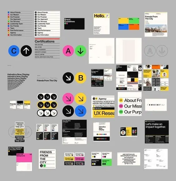
Once all these elements exist, you need a place where they live together with rules. This might be a brand guidelines document or style guide that explains how to use the logo, colors, typography, images, and motion. It might be a focused logo guide that covers just the do's and don'ts. Or it might be a full brandbook that includes all of the above plus brand strategy, tone of voice, messaging, and positioning.
These documents exist to ensure consistency across platforms – your website, social media, ads, packaging, office signage, internal documentation. When someone on your team needs to create a slide deck or a social post, they should be able to reference the guidelines and know exactly how to use the visual elements.
In mature organizations, these guidelines get implemented as design systems and component libraries. Developers and marketers literally can't break the visual identity in day-to-day work because the system constrains their choices to approved patterns. This isn't about limiting creativity – it's about making it easier to create consistently good work without having to think through every visual decision from scratch.
What a strong visual identity actually does
In crowded markets, your visual identity is often the first thing people notice – and sometimes the only thing. If your shop, SaaS, or app looks like every other generic template on the internet, people have no visual reason to remember you. A distinctive visual system makes your brand recognizable from across the street or in a fast social scroll. It gives people something to latch onto before they've read a single word.
Humans judge by appearance long before they read the fine print. Consistent, well-crafted visuals signal that you care about details, that you invest in your product, that you probably won't disappear tomorrow. Multiple studies and industry reports connect brand consistency with higher trust, stronger loyalty, and better marketing performance. It's not just aesthetics – it's business logic.
When your logo, colors, typography, and imagery are aligned, every new campaign reinforces previous ones instead of resetting the impression. Your performance creatives can iterate faster because the system already gives you layouts, hierarchy, and patterns. Media spend works harder because your visuals are instantly attributable to your brand. You're not starting from zero with every campaign.
Without a coherent visual identity, it's hard to run effective outdoor campaigns, launch on marketplaces that require brand assets, or maintain multiple touchpoints without everything looking different. Even a minimum viable identity – logo, colors, typography, basic guidelines – dramatically lowers friction when you expand to new markets or channels. You have assets ready to go, and they all work together.

Do you always need a full visual identity?
Honest answer: no. There are cases where a heavy investment in visual identity might not be necessary right now. If you're in a very narrow B2B niche with almost no competition, if you're pre-MVP and still testing what the product even is, or if your pipeline is fully relationship-based with few clients and long contracts and no public presence, you might be able to get away with something minimal.
But you probably do need at least a basic visual system when you operate in a competitive market and want to be chosen over look-alike alternatives, when you're entering a new geography and need to build recognition from zero, when you sell anything with packaging or a strong physical presence, or when your team has started making assets ad-hoc and everything looks different.
A reasonable path is to start with essentials – logo, minimal palette, typography, basic rules. Then add depth as you grow: graphic language, motion system, expanded palette, more real-world examples. Eventually, codify it all into a full design system with components, tokens, code, and internal libraries. You don't need everything on day one, but you do need a foundation that can scale.
How Pragmica approaches visual identity
At Pragmica, visual identity projects usually sit inside a larger product or brand engagement. We start by clarifying where visual identity fits into your broader brand strategy. Then we design systems that work across digital products, marketing, and content – not just something that looks good in a Behance case study but falls apart in real use.
We think beyond static layouts. How does the identity work in UI states? What happens in dark mode versus light mode? How does it adapt to different screen sizes? We deliver guidelines and components your team can actually maintain – not a pretty PDF that nobody opens, but living systems that make it easier to create consistent work.
If you already have a logo and some colors, we can evolve them into a coherent system. If you're starting from zero, we can help you build identity and product visuals together so they don't drift apart over time. The goal is always the same: create a visual system that makes your brand recognizable, trustworthy, and easier to work with – not just today, but as you grow.

