Typography isn't about picking a pretty font. It's about making text work: readable, scannable, expressive. Get it right, and your message lands. Get it wrong, and people skip it.
At Pragmica, we treat type as part of the product. It shapes how people feel about a brand, how fast they understand information, how confidently they move through an interface.
Here's what we'll cover:
- what typography actually is,
- key terms your team should know,
- font categories and when they work,
- principles that actually matter,
- mistakes that kill designs,
- and licensing basics you can't ignore.
What Is Typography and Why Does It Matter?
Typography is how you structure and style text: which typeface, what size, how much spacing, alignment, contrast, composition. It's not decoration – it's about making information easy to read, scan, and understand.
In branding and digital products, typography does a few things:
- Guides attention – shows where to start, what matters, what's secondary.
- Sets tone – playful, strict, experimental, minimal, premium.
- Supports the idea – a fintech dashboard shouldn't feel like a kids' brand or a gaming interface.
- Reinforces identity – sometimes type becomes the core of the visual language.
Messy, inconsistent, or hard-to-read type makes everything harder – even if your message is strong.
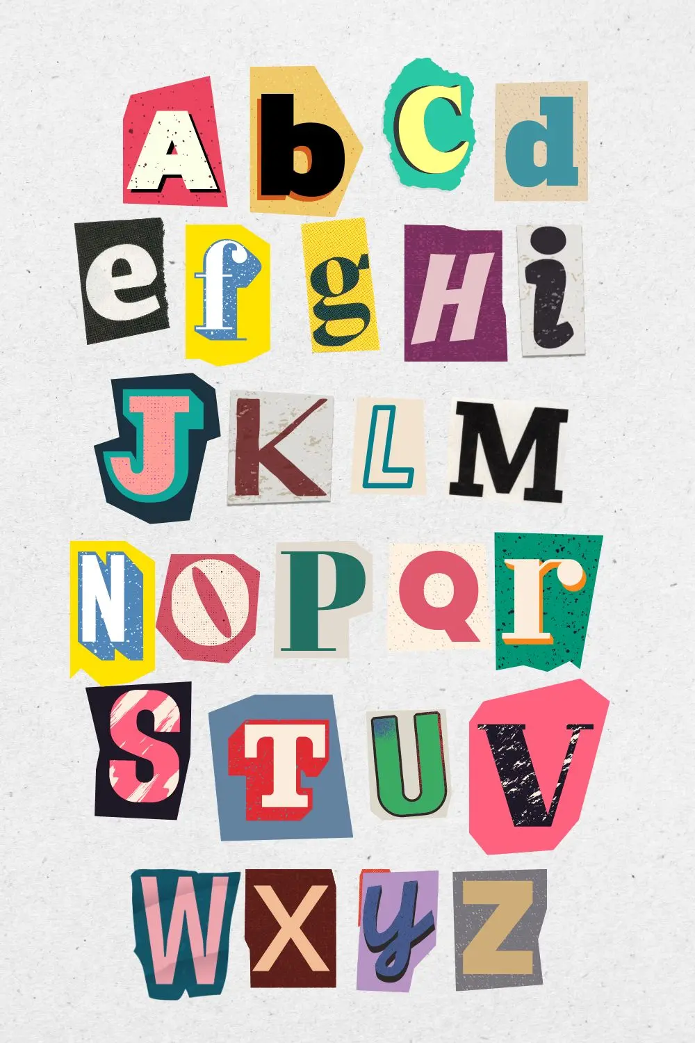
Key Terms (Without the Jargon Overload)
You don't need to become a typographer, but having shared vocabulary helps. Here's what matters:
- Font / typeface – the visual design of letters and symbols.
- Typeface family – all styles of one typeface (regular, bold, italic, etc.).
- Superfamily – several related families designed to work together (e.g., serif + sans serif variants).
- Serif – small strokes at the ends of letterforms.
- Sans serif – typefaces without serifs; usually cleaner and more modern.
- Tracking / letter spacing – space between letters.
- Leading / line spacing – space between lines of text.
- Indent / spacing between blocks – vertical spacing between paragraphs or content groups.
- Composition – how text and visuals are arranged in the layout.
- Contrast – visual difference in size, weight, color, or style that creates hierarchy.
- Grid – invisible structure used to align and organize content on a page or screen.
With these terms clear, you can actually discuss why something feels off and how to fix it.
Main Font Categories and Where They Work
Designers can dive into micro-classifications, but for most teams, this breakdown is enough.
Serif Typefaces
Serif fonts have small finishing strokes on letters. They feel traditional, editorial, book-like.
Good for:
- Long-form reading – articles, reports, books
- Serious brands, editorial layouts, industries that value heritage and stability
Slab Serif
A subcategory of serif fonts with thick, blocky serifs.
Good for:
- Bold headlines and strong, confident messaging
- Brands that want to feel robust, industrial, or outspoken
Sans Serif (Grotesk / Geometric / Humanist)
Sans serif fonts have no serifs. They're the default for modern digital products. Different flavors: geometric, humanist, neo-grotesque.
Good for:
- Interfaces and dashboards
- Corporate and tech brands
- Clean, flexible design systems
Script and Handwritten Type
These mimic calligraphy or handwriting. They add a human, emotional touch.
Good for:
- Short accents in branding, packaging, posters
- Situations where you need personality and warmth
Not good for: long paragraphs or small UI text – they're usually tiring to read in large quantities.
Decorative / Display Typefaces
Highly expressive, stylized fonts. Often reference a specific era, culture, or subculture.
Good for:
- Large headlines, posters, campaign visuals
- Occasional use in brand visuals to create a strong mood
Not good for: body text or system UI — they exhaust the eye very quickly.
Monospaced Fonts
All characters occupy the same horizontal width. Traditionally used in code and terminal interfaces.
Good for:
- Developer tools, dashboards, and tech products
- Data-heavy or code-related visual language
- Situations where you want a "technical" or "system" feel
How to Choose a Typeface for a Project
When we pick type for a product or brand, we don't start with "what looks cool?" We start with context:
- Who is the audience?
B2B SaaS buyers, parents of young kids, crypto traders, gamers – they all expect different visual languages. - Where will this text live?
Mobile app, desktop web, print materials, outdoor, or all of the above? Legibility and rendering differ per medium. - What languages are needed?
Many modern fonts still have limited character sets. If you need Latin + Cyrillic + symbols, check this early. - How should it align with the brand?
If the brand is precise and systematic, a geometric sans might be perfect. If it's about storytelling and craft, a serif or humanist sans may work better.
Core Principles of Good Typography
You don't need dozens of rules. A small set, applied consistently, already transforms design.
1. Hierarchy
Hierarchy shows what's most important: title → subtitle → body → captions. Size, weight, color, spacing all contribute.
If everything looks the same, nothing stands out. A good layout lets someone skim and still understand the structure.
2. Readability
Readable type lets you consume text quickly, without effort. Key factors:
- comfortable font size – usually 16–18 px for body text on web
- enough line spacing
- clear contrast between text and background
- predictable line length – not too long, not too narrow
If users squint, zoom, or re-read, the design is failing – no matter how "beautiful" it looks.
3. Contrast
Use contrast to highlight what matters:
- size – big headline, smaller body
- weight – bold vs regular
- color – accent vs neutral
- style – serif heading + sans body, or vice versa
The difference between levels should be obvious, not subtle.
4. Grid and Composition
A grid keeps your layout coherent. Columns, margins, consistent spacing give the page rhythm and structure. Users don't see the grid, but they feel the order.
At minimum:
- align text blocks and images along a clear grid
- keep consistent spacing between headings, paragraphs, sections
- avoid random centering or offsetting without a reason
5. Consistency
Using three, four, or five different fonts in one layout almost always breaks visual logic. Common rule:
- 1–2 typefaces per project
- extended families or superfamilies if you need variety – condensed, wide, mono
- consistent mapping of styles to roles – H1, H2, body, caption
Consistency doesn't limit creativity – it creates a stable framework for it.
6. Space and Emphasis
White space is as important as the letters.
- Use margins and padding to separate logical blocks
- Use bold, color, or size to emphasize key phrases – but only where the meaning actually changes
Well-structured spacing lets the eye breathe and gives complex information a clear rhythm.
Common Typography Mistakes We See All the Time
Even strong visual concepts collapse because of basic issues.
- Too many fonts
Feels chaotic, amateurish. Pick a small, disciplined set and stick to it. - No hierarchy
All text looks the same size and weight. Pages turn into gray blocks. Add clear levels. - Bad readability
Tiny text, ultra-light weights, low contrast. Looks "cool", doesn't get read. - Ignored spacing
Lines too close, paragraphs glued together, no breathing room. Feels heavy, stressful. - Zero grid / alignment
Headlines, images, paragraphs randomly float in space. Even a simple 2–3 column grid dramatically improves quality.
When we audit digital products at Pragmica, we often get big wins just by fixing these five issues before touching anything else.
Fonts and Licensing: Don't Ignore Legal Details
Type is intellectual property. Misusing fonts in commercial projects can cause real legal and financial trouble. Basics:
- Always read the license before use – even for "free" fonts
- Check whether commercial use is allowed, and on which platforms – web, app, print, logo
- Use trusted sources: Google Fonts, Adobe Fonts, foundries with clear licensing
- Don't modify or redistribute fonts in ways the license doesn't allow
- Keep purchase and license records – especially if you work with large clients
This isn't just legal compliance – it's part of professional ethics in design and product development.
Final Thoughts
Typography sits at the intersection of aesthetics and function. It structures information, directs attention, expresses personality, makes communication feel effortless.
You don't need to memorize every historic classification. But understanding hierarchy, readability, contrast, spacing, and licensing gives you a solid foundation – whether you're a designer, product manager, marketer, or founder.
At Pragmica, we look at typography as part of the system: how it lives inside the brand, the interface, the broader product story. When type is treated carefully, the whole experience becomes clearer, calmer, more trustworthy – and users feel it, even if they can't explain why.