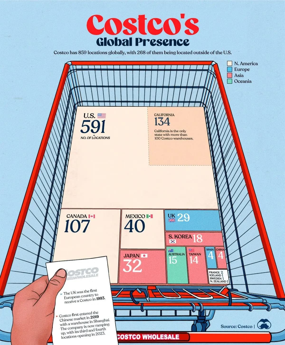
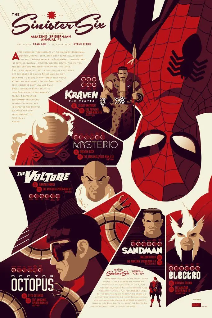
In digital products, dashboards, brand decks, and annual reports, you're often fighting the same battle: there's too much information, and not enough attention. Infographics are one of the fastest ways to win that battle. Used well, they turn complex data into something people can actually see, remember, and act on.
But what is an infographic, really? In the simplest terms, it's a visual representation of information or data that helps people understand a topic quickly. Charts, diagrams, timelines, maps, annotated visuals, icon sets – all of these count. It's not just a pretty picture or one nice chart. A good infographic combines data and content (facts, numbers, processes, relationships), visual structure (layout, shapes, connections, grouping), and narrative (a clear idea about what exactly you're trying to show).
Today the term is used broadly. A product comparison card, assembly instructions, a metro map, an interactive timeline, or a hero number in a report – all of these can be considered infographics if they explain information visually. The format doesn't matter as much as the function: does it help someone understand something faster than text alone would?
Why infographics matter for products and brands
Infographics explain faster than text. Imagine reading a long, text-only manual: "Insert screw A into hole 5. Tighten with part C. Repeat for all side panels…" Now imagine the same thing shown as simple, clear drawings with arrows. Even if you've never assembled furniture, you stand a chance. That's exactly what a good infographic does in any context – it explains a process, compares options, shows before and after, reveals structure, or highlights patterns in data. Our brains are wired to spot visual patterns much faster than to parse long paragraphs.
They also highlight what matters most. A large number, a bold icon, a timeline, or a schematic diagram on a page immediately pulls your eye to the key point. In an annual report, that might be one big number about revenue or freight volume. On a product page, it might be icons highlighting three or four main benefits. On a landing page, it might be a timeline that explains how fast you deliver results. Without visual emphasis, those important details drown in generic text. With a simple graphic hierarchy, they become obvious.
And they can literally increase sales and conversions. A site with clear navigation and meaningful icons feels faster and easier to use. Product cards with structured visuals – showing who it's for, key specs, benefits – reduce friction. Visual instructions lower post-purchase frustration and support load. All of that translates into higher conversion, fewer returns and tickets, and more trust in the product. Infographics aren't just decor – they're UX.
Principles of effective infographic design
If you need to visualize a complex process, there is no shortcut: you have to go deep into the topic. Before you open Figma, talk to subject-matter experts. Clarify who will read this – specialists or a general audience. Understand what's critical to show and what can be simplified. The same diagram will look very different for investors (who need the macro story, key metrics, and risk), internal specialists (who need precise steps and technical details), or end users (who only need to see what helps them make a decision). Without this step, you'll either oversimplify and lose trust, or overload and lose comprehension.
Simplicity and clarity matter. A quick self-test: if you see the infographic and can tell the topic, but can't decode the content, something is wrong. Typical reasons are that elements aren't grouped logically, everything looks the same visually, or there's no clear sorting principle. Good infographics usually group elements into clear categories (styles, phases, inputs and outputs, pros and cons), use consistent patterns inside each group (same icon style, same label structure, same color logic), and follow a familiar order – chronological, by size, by frequency, A to Z, left to right.
The same rules apply to simple things like product cards. Same structure of bullet points for all SKUs, same icon style for all benefits, same order of features from most important to secondary. Your reader should never ask where to start reading. The path should be obvious.
Hierarchy matters because not all information is equal. The most important elements must stand out more than others. You can use size (larger number or label), weight (bold versus regular), color (accent versus neutral), or position (top or left, or central in the layout). This works for titles and hero numbers in articles, KPIs on dashboards, callouts in presentations, and of course any infographic. If everything is loud, nothing is heard. Design hierarchy so that the eye travels through the story in the right order.
Typography should prioritize readability. For headlines, a clean sans-serif usually works well. For body text, choose something highly readable at smaller sizes. Even at small point sizes, a well-designed serif can be easier to read in long blocks than a geometric sans – the key is high contrast and comfortable line height. For infographics, avoid overly decorative fonts, keep the number of different typefaces low (one or two families is enough), and don't set long paragraphs over busy backgrounds. The typeface should disappear as a problem and let the content be the focus.
Color should be utilitarian first, decorative second. For analytical, scientific, or complex data, color should encode meaning – groups, categories, data series, layers. One color equals one type of object. Avoid using color purely for decoration; it will turn the graphic into noise and make reading harder. For marketing and commerce, you still need clarity, but you're allowed more emotional color. A strong accent color can help pull attention to a key insight, even if it's not strictly data-encoded. The danger is crossing into sensational visuals that overshadow the actual message. Think of color as a tool with two modes: structure (to separate layers of information) and emotion (to grab attention and set tone). Use both consciously, not accidentally.

Tools to create infographics
You don't need exotic software to start designing strong infographics. There are many modern services that let you create decent infographics without a heavy design stack. Infogram is focused on charts, dashboards, and data storytelling, with AI-assisted layouts for non-designers. Canva has a large template library, simple drag-and-drop, and basic AI features – good for social and marketing visuals. Visme, Venngage, Piktochart, and others are also popular visual storytelling tools that mix presentations, charts, and infographics. They're useful when you need something quick for internal reports, when a non-designer needs to update charts regularly, or when you're testing formats before investing in custom design.
For more custom and precise work, teams still rely on a familiar toolkit: Figma, Sketch, or Illustrator for high-fidelity layouts and design systems; Excel or Google Sheets to explore and structure data before visualizing it; Keynote or PowerPoint for presentation flows where infographics need to live inside slides. But the tool is less important than the clarity of your idea, the logic of the data, and the discipline to keep things simple.
Want to get better at infographic thinking?
A few classic resources are worth your time. Edward Tufte's "Envisioning Information" is a seminal book on how to display complex information clearly. It covers topics like layering, color for information, small multiples, and multi-dimensional data on flat surfaces. Guides on chart selection and data storytelling focus on which chart to use for which type of data – comparison, distribution, part-to-whole, change over time. These are useful not only for designers, but also for analysts and product managers. Curated galleries of good and bad infographics are also valuable. Seeing a lot of real examples – dashboards, editorial spreads, product explainers – is one of the fastest ways to build your intuition for what works and what doesn't.
Final thoughts from Pragmica
Infographics are not extra decoration at the end of a design process. They are a way to think through complex information, a way to communicate that thinking to others, and a way to respect the user's time and attention.
When we work on products, brands, and reports at Pragmica, we treat infographics as a design tool with a simple checklist. Do we really understand the subject and the audience? Is there a clear story – what we want someone to understand in five to ten seconds? Are grouping, hierarchy, type, and color helping that story, or fighting it? Could someone unfamiliar with the topic still follow the logic?
If the answer is yes to all four, you're probably looking at a useful infographic, not just a beautiful picture.


